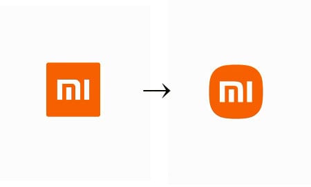
Xiaomi has changed the design from the old logo (left) to the new logo (right).
Chinese electronics manufacturer Xiaomi is being ridiculed for launching a new logo.
According to the Hong Kong South China Morning Post (SCMP) on the 2nd, Xiaomi founder and CEO, Chairman Lei Jun, announced a new logo design on the 30th of last month at an event declaring Xiaomi’s entry into the electric vehicle market.
Chairman Leijun explained that he has been promoting the logo change since 2017, and explained that he received the help of Kenya Hara, who is also a famous Japanese designer and artistic director of MUJI.
However, there was no difference in the changed design except that the existing square border was changed to round. In addition, it was revealed by Chinese netizens that the cost of changing the logo design was 2 million yuan.
Accordingly, Chinese netizens poured out ridicule through SNS such as Weibo, such as “Xiaomi should report to the police” and “I can do it for 20,000 yuan (about 3.4 million won).” The article “Lei Jun was scammed” received more than 4000 likes.
Leijun, as if predicting such a reaction, asked the audience at the event, “Are you disappointed with the new logo?” He emphasized that the new logo represents the improvement of the company’s philosophy and quality.
SCMP reported that there is also an analysis called noise marketing’ that draws attention using deliberate speech. The 300 million won is not the cost of the design itself, but the cost of creating a topic online.